Module Bogue.Popup

module Popup: sig .. end

Put layouts on top of others, or in new windows.

This module provides usual modal popups like "info" boxes or "yes/no" popups.

Internally, popups are layouts inserted in a destination layout, but belonging to a different layer, which ensures that they are drawn on top of the destination layout.

Warning: For all functions in this module, the destination layout must be a house, not a single resident. (This means that the layout's Layout.room_content must not be a Resident.)

When the dst destination parameter is optional, and if it is not provided, then the popup will be created in a separate new window.


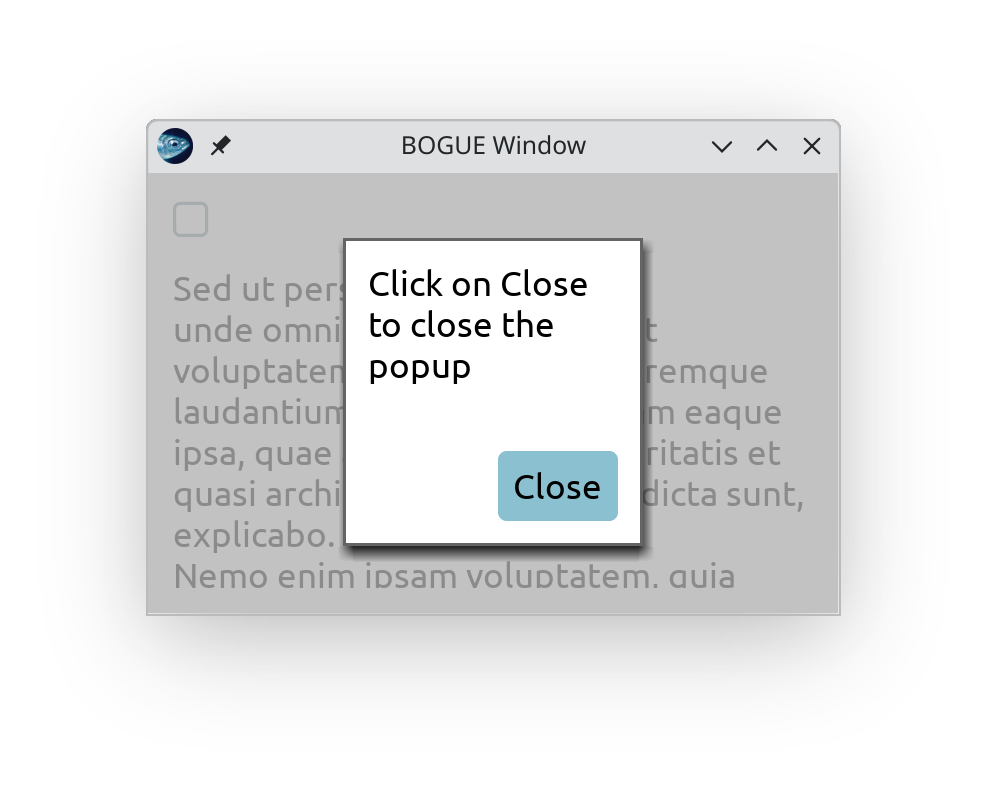
A simple modal popup with a single button (Example #21bis)

Popups can (optionally) be closed by pressing ESCAPE (even if ESCAPE is used for another action in the main application, see Example 21bis).

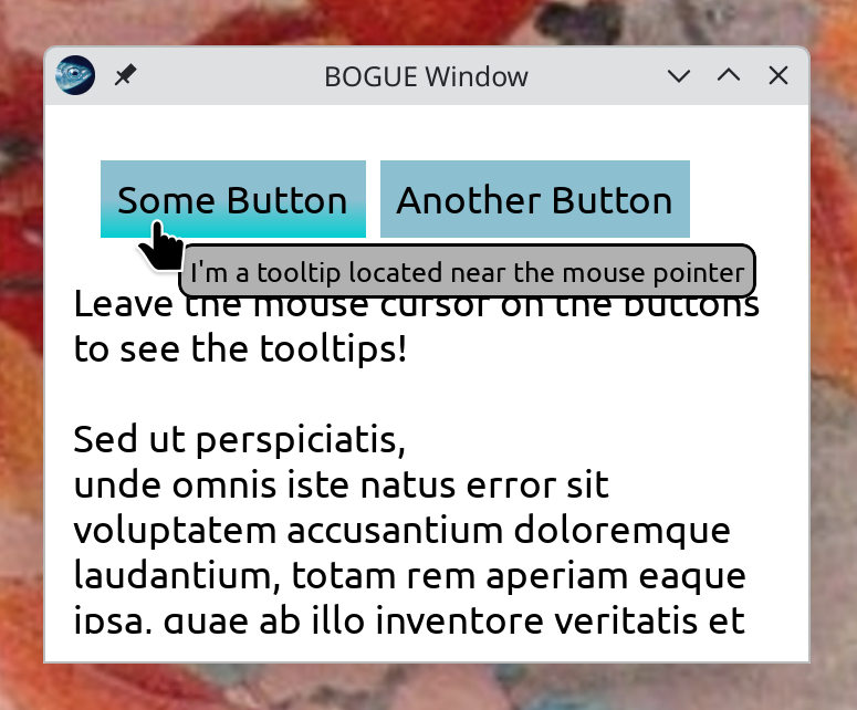
Popups are also used to display tooltips.

Dependency graph

Generic functions

These functions allow you to craft your own popups, when the predefined ones below are not enough. See Example #21.

val add_screen : ?color:Draw.color -> Layout.t -> Layout.t

Add a screen on top of the layout. This can be useful to make the whole layout clickable as a whole.

val attach : ?bg:Draw.color ->
?show:bool -> Layout.t -> Layout.t -> Layout.t

Generic modal type popup

attach house layout adds two layers on top of the house: one for the screen to hide the house, one for the layout on top of the screen.

Predefined popups

val info : ?w:int ->
?h:int ->
?button_w:int ->
?button_h:int -> ?button:string -> string -> Layout.t -> unit

Add to the layout a modal popup with a text and a close button. By default, button="Close". This popup can be closed by pressing ESCAPE. Use the optional parameters button_w, button_h to impose the size of the button. The optional parameters w and h set the width and height of the popup (including the button) by scaling the computed layout. If they are too small, the text might not be fully legible.

val yesno : ?w:int ->
?h:int ->
?button_w:int ->
?button_h:int ->
?yes:string ->
?no:string ->
yes_action:(unit -> unit) ->
no_action:(unit -> unit) -> string -> Layout.t -> unit

Add to the layout a modal popup with two yes/no buttons. By default, yes="Yes" and no="No". This popup is not closed by pressing ESCAPE. See Popup.info for other common parameters.

val one_button : ?w:int ->
?h:int ->
?on_close:(unit -> unit) ->
button:string ->
dst:Layout.t -> ?close_on_escape:bool -> Layout.t -> unit

Add to dst the given layout and one button with the button string. Clicking the button will close the popup and execute the optional on_close function.

val two_buttons : ?dst:Layout.t ->
?board:Main.board ->
?button_w:int ->
?button_h:int ->
?w:int ->
?h:int ->
?screen_color:Draw.color ->
label1:string ->
label2:string ->
action1:(unit -> unit) ->
action2:(unit -> unit) ->
?connect2:(Widget.t -> unit) ->
?close_on_escape:bool -> Layout.t -> unit

If dst is present, a popup containing the given layout (and two buttons) will be contructed inside dst, otherwise a new window will be created. In the latter case, the creation of the new window depends on the board argument. If the board argument is provided, the new window will be immediately attached to the board; otherwise, the new window will be created (by the main thread) when the board is running, at the start of the next frame. The board argument has no effect if dst is provided.

The optional function connect2 will be immediately called with the second button widget as argument. It can be used to establish a connection to or from the second button. For instance, one can use this to disable the button if some condition is not met. (This is used for instance in File.select_file.)

Tooltips

Tooltips are informative pieces of text that show up when the pointer stays idle for a moment over a given widget.

See Example #44.


A button with a tooltip (Example #44)

type position = 
| LeftOf
| RightOf
| Above
| Below
| Mouse
val tooltip : ?background:Layout.background ->
?position:position ->
string -> target:Layout.t -> Widget.t -> Layout.t -> unit

tooltip text ~target widget layout adds a tooltip which will appear on layout, next to target (which should be a sublayout of layout), when the widget gets mouse focus and mouse is idle for some time on it. A tooltip it not a modal popup, it does not prevent from interacting with the rest of the layout.